- All Posts
- /
- 26 Best Email Marketing Tips from The Leading Brands

26 Best Email Marketing Tips from The Leading Brands
Messaging and Automation-
 Alexandra Solymar
-
Updated:Posted:
On this page
There are countless elements that can make or break an email. Layout, readability, buttons, and minor psychological tricks are but a few things you need to keep in mind when designing emails that will trigger action.
Conversions don’t happen by accident and neither do great emails.
The following 25 tips are based on emails from some of the world’s smartest companies.
1. Let images do the talking.
Make the text-to-image ratio lean in favor of images. Custom graphics might convey your message better than words.
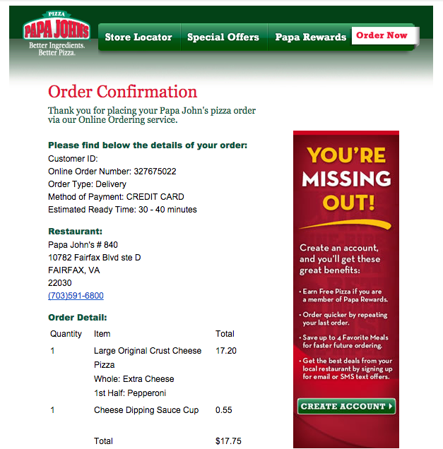
2. Go for the small win.
The Papa John’s order confirmation asks customers to create an account. The idea here is that the customer has already used the company’s online services, so he/she can benefit from creating an account. It’s not a sale but it’s an important small win.
Take advantage of having a foot in the door.
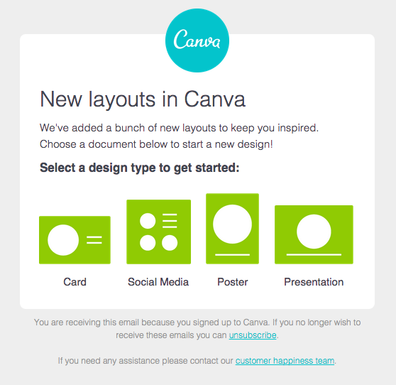
3. Keep it short and sweet.
Canva could have sent a lengthy email, discussing the use cases and benefits of its new layouts. But they didn’t, and opted for super short and clear messaging instead. Take note of the simplistic but still expressive illustrations.
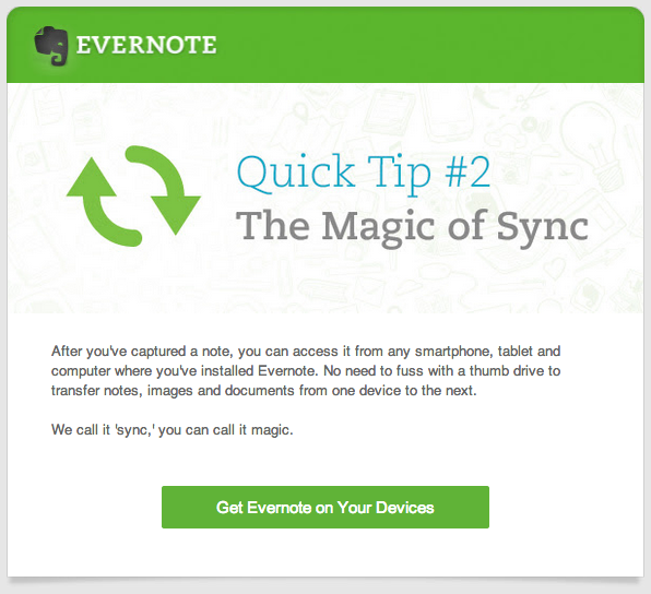
4. Use consistent branding.
Evernote nails branding. The primary elements of the company’s branding, both on its website and in its marketing material, are the characteristic green color and the elephant logo.
In your emails, use design assets that are already familiar to your customers.
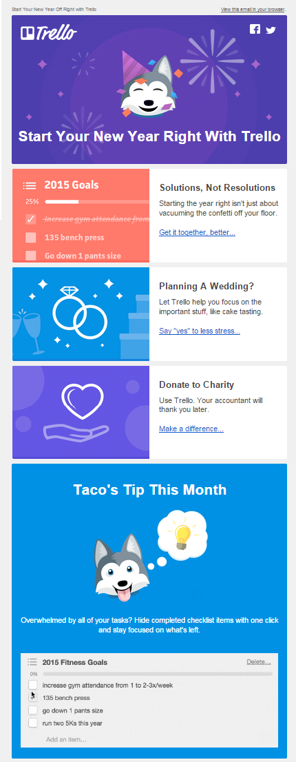
5. Design a great mascot.
You’re introduced to Trello’s mascot, Taco, as early as the bottom of the company’s homepage. He’s a very likable and notable part of Trello’s branding that encourages users to warm up to the company.
You may want to invest in designing a company mascot that can become a basic element of your branding too.
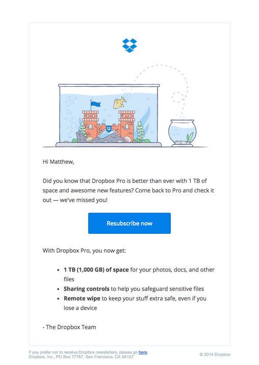
6. Use unique, original illustrations.
Visuals should tell a relevant story to the content.
Dropbox is especially good at featuring sleek illustrations in their emails (see their other email below). Stock images are great and easy to obtain, but you might make a better, long-lasting impression with an image that you (or your designer) created specially for your email.
7. Get going with GIFs.
Emails with animations stand out from the rest.
Your subscribers are guaranteed to pay more attention to animations than static images, so make sure your message comes across in the GIF as well as the rest of your email. That being said, some email clients don’t display images automatically, so make sure your is great too.
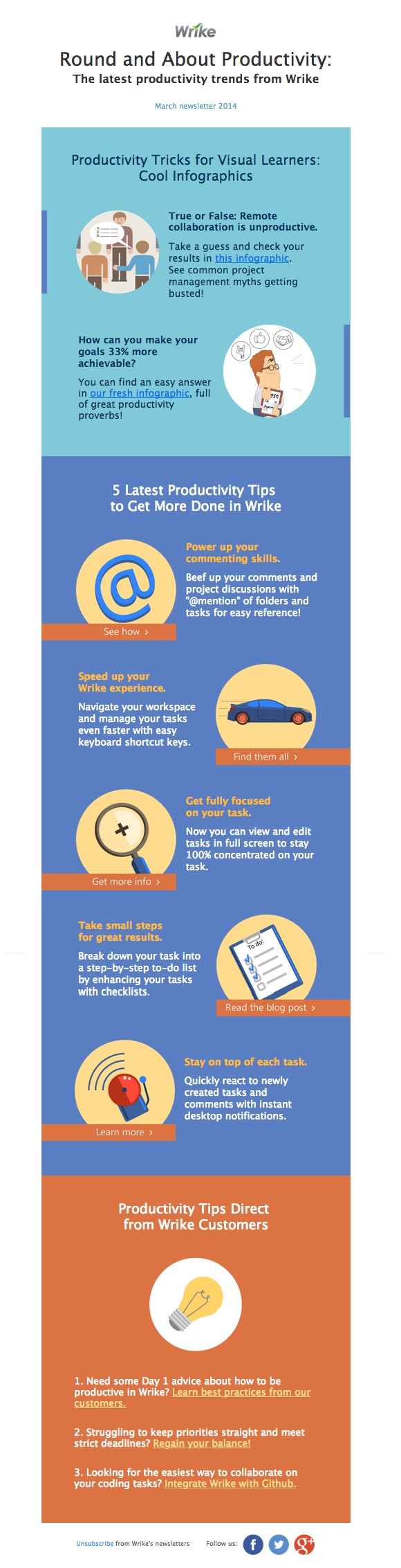
8. Go for the infographic look and feel.
Colorful infographics are more engaging because they convey easily digestible information faster than text-heavy content.
The inbox is actually a great place to read an infographic. Just make sure you consider mobile devices while designing your graphic. Clear, bold images and text will be easier to read on small devices.
9. Make your customers feel special.
There are ways to show appreciation besides coupons and promotions. You can always make your users feel special with a sneak peek or a preview of written or video content. Do you have an informative blog? Share articles a few days before their official release date with a select group of customers.
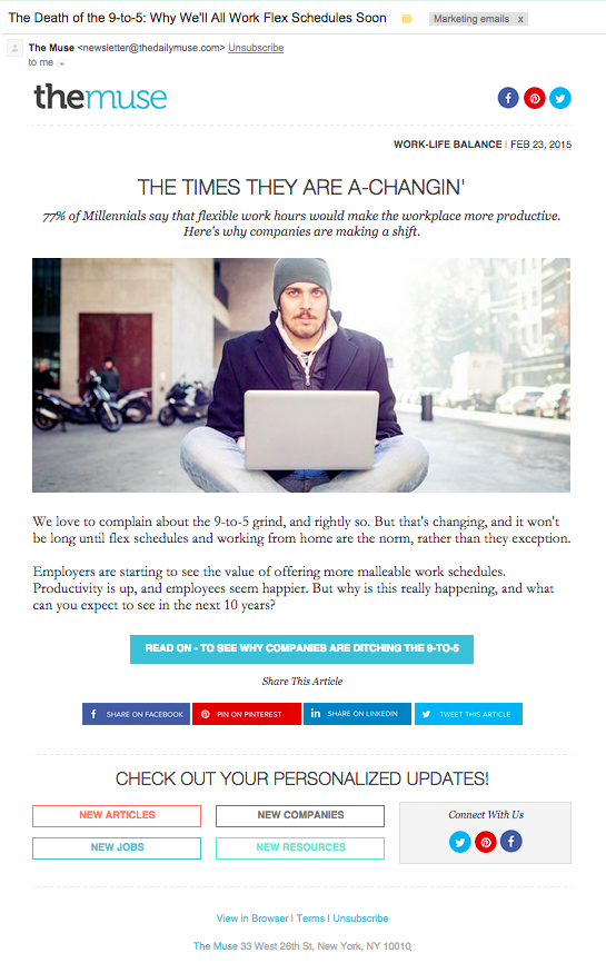
- Use emotionally-charged subject lines.
This subject line, “The Death of the 9-to-5: Why We’ll All Work Flex Schedules Soon” hits the spot because it can entice both those who agree and who disagree with this statement.
Some might associate themselves with the message, whereas others might think, “Whoa, my work schedule might radically change…for the better?” (Additionally, the Bob Dylan/pop culture reference in the title is a nice touch.)
Your subscribers are bombarded with dozens of emails daily. Make your emails stand out with alluring, fun, or bold subject lines.
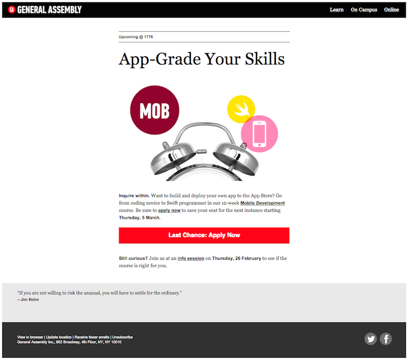
11. Focus on a clear call to action.
This General Assembly CTA communicates urgency effectively with its wording and bright red color. Your button copy is the most important part of your CTA – make sure it’s designed to be clicked.
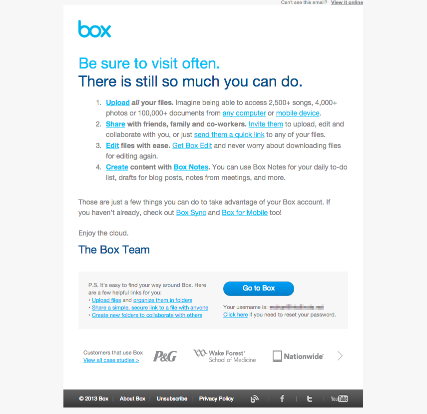
12. Use hyperlinks for emphasis.
This email uses colored hyperlinks to draw readers’ attention to important words and phrases. They lead each point with a hyperlink, then link other important phrases like “mobile device” and “send them a quick link”.
This is an underused copywriting trick that more marketers should be taking advantage of.
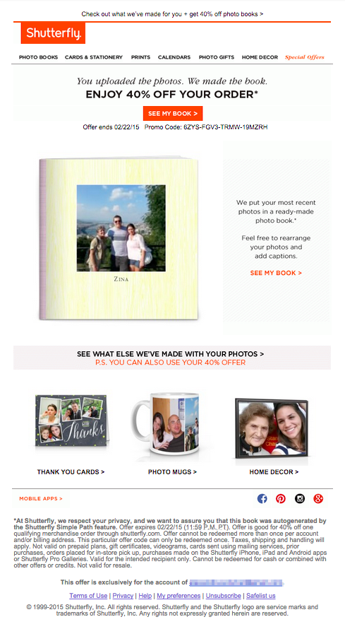
13. Take personalization to the next level.
Shutterfly includes users’ uploaded photos in their emails. They are pulling at the heartstrings by offering products that have pictures of loved ones and good memories pasted all over them … for 40% off.
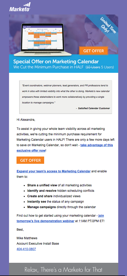
14. Add an element of urgency.
This exclusive offer from Marketo encourages users to upgrade their subscriptions. Marketo adds urgency to the email with a “Limited Time Only” ribbon in the header, a webinar invitation for the following day, and by using the “Get Offer” button repeatedly.
Expressions such as “limited seats” or “X Weeks Left to Save” would work similarly. Note that Marketo placed a favorable customer quote at the beginning of the email too.
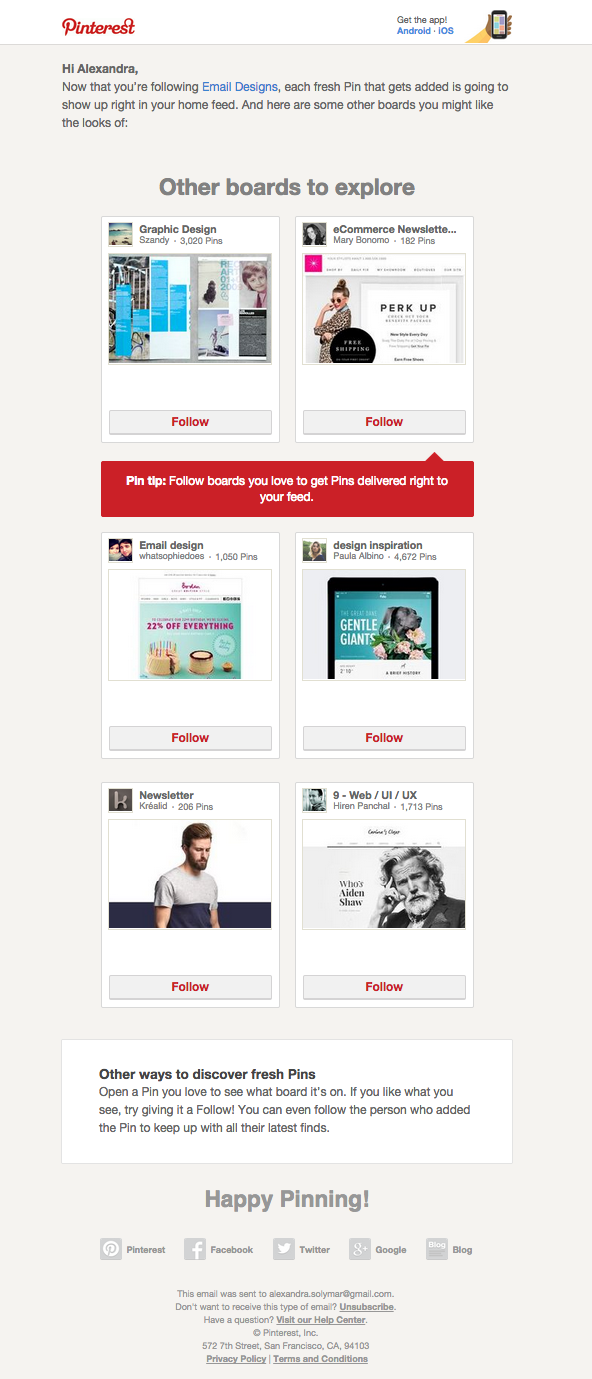
15. Create real value for the recipient.
Pinterest’s board suggestions are welcome in my inbox because they are personalized just for me.
Use data to your advantage. Make your users love your emails by sending them content that has value beyond tips on using your product and coupons that apply to your product. Make it more about them than about you: Offer a useful webinar, an ebook download, or just truly valuable, non-promotional content.
16. Be reliable and predictable.
Every Sunday, The Muse sends out a digest with the subject line, “Your Sunday Inspiration.” I now expect to see it in my inbox every week, and look forward to browse their good content.
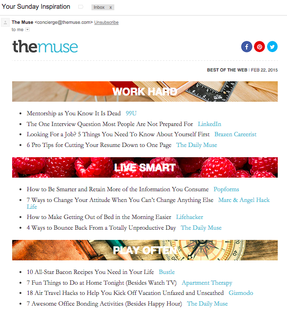
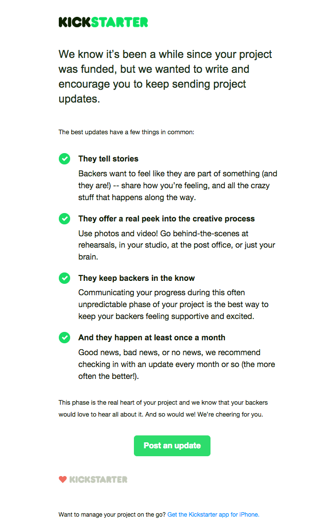
17. Don’t be afraid of bullet points.
This Kickstarter email is easy on the eyes. The content is digestible and organized in neat bullets. At the end of the email, the CTA is clear, and it really sums up what the entire email wants you to do.
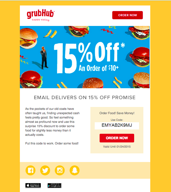
18. Harness the power of colors.
Studies have shown that colors affect our moods. Primary colors, especially red, evoke appetite. GrubHub uses the psychological frailty of mankind to its advantage and, even subconsciously, tells you to order food. Keep your company’s industry in mind when you’re designing your emails.
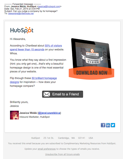
19. Send emails from a real person.
Over the past year, I have received emails from at least eight different HubSpot team members. That makes me feel less like I’m another lead in a marketing database. When I see emails from real people, I’m more likely to open and read what they sent me. I also know that my reply will end up in their email account.
In the body of the email, you can even see their pictures!
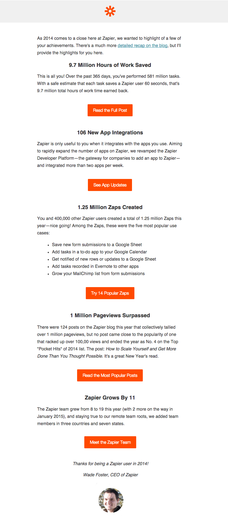
20. Publish numbers and data.
Although this email by Zapier is lengthy, its layout makes it easy to read through it. So what works in this email?
- The second paragraph (on hours of work saved) is rewarding for the user.
- Good visual segmentation of content
- Lots of buttons – each paragraph is followed by one
- Overall, the email has a trivia/”fun facts” feeling to it. People love fun facts.
- The sender is the CEO of the company …
- … who has his picture in the bottom of the email. (A real person!)
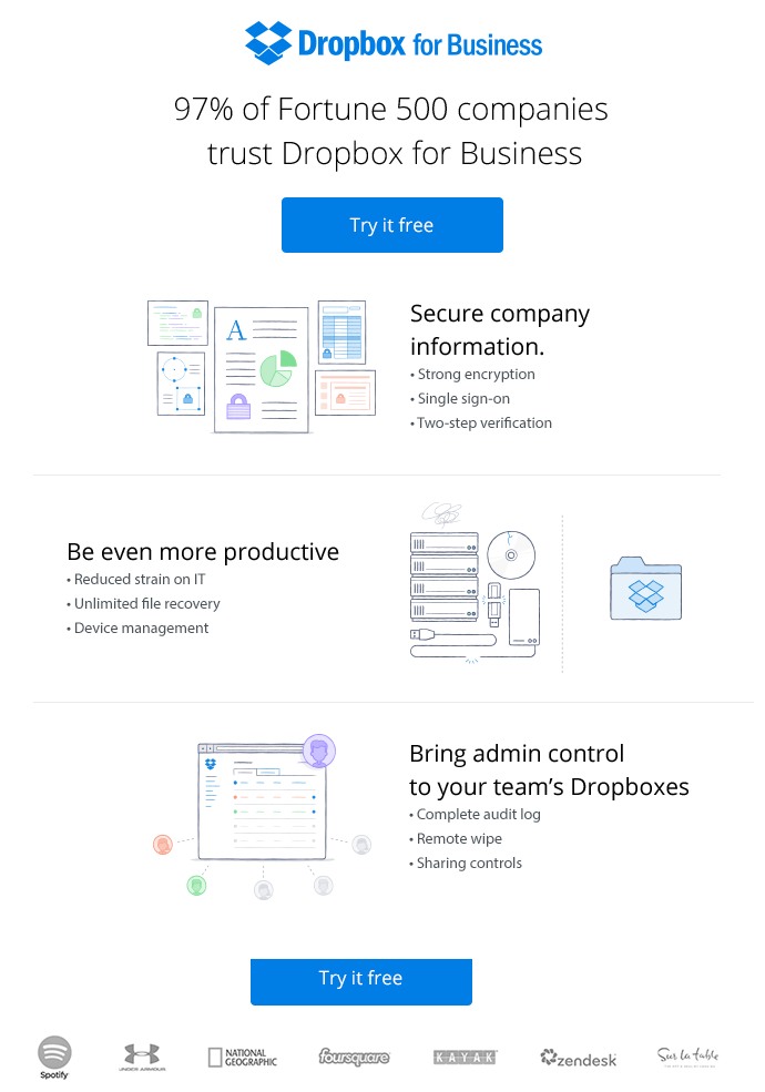
21. Use your customers’ logos as social proof.
Using customer logos (with their permission) in emails increases your credibility. Selling a business product, as Dropbox for Business is doing here, you’ll look pretty trustworthy when you have such large, recognizable clients.
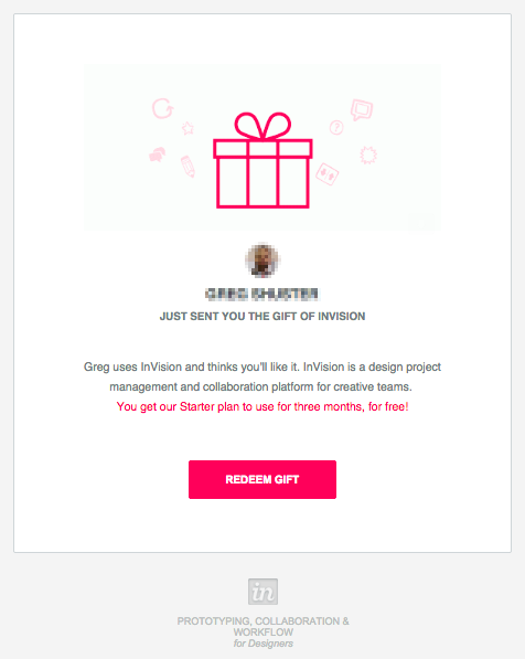
22. Redirect responsibility.
The persuasive power of InVision’s invitation email lies in the shifting of responsibility onto the recipient of the email.
An already existing InVision user triggered this email to a contact of his, but ultimately, it’s the other party’s responsibility to take action. The recipient is likely to follow the CTA’s prompt, since he knows the sender and even sees his picture in the email. These responsibility redirections and contact references works for all types of invitation emails.
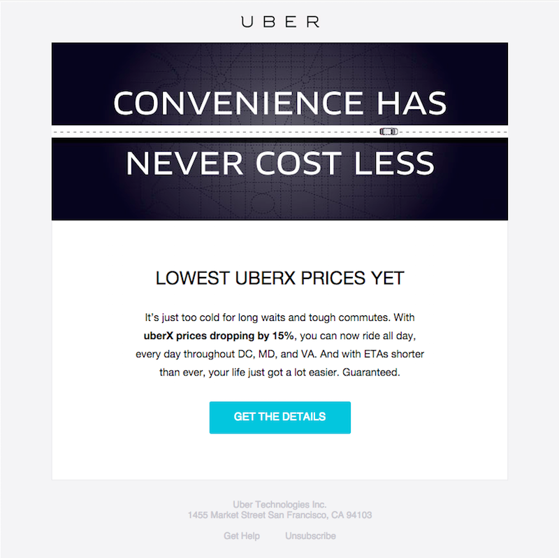
23. Marry copy and design.
You’ll notice the symbols of Uber’s industry –a road and a car– in the company’s simple and dramatic, black header. This header demonstrates that you don’t have to go out of your way to design an elaborate, grand header.
24. Write mobile-friendly copy.
Depending on the product and target audience, 15 to 70 percent of email-opens occur on mobile devices. This makes mobile-friendly copies extremely important.
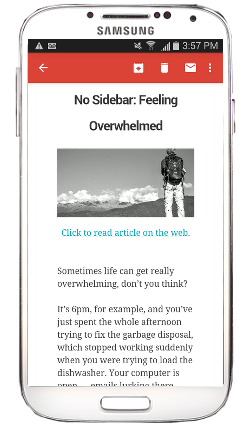
Of course, some content works better on mobile than others. No Sidebar’s text-heavy emails are great to read on mobile. The font remains relatively large and easily readable on any device.
25. Be current.
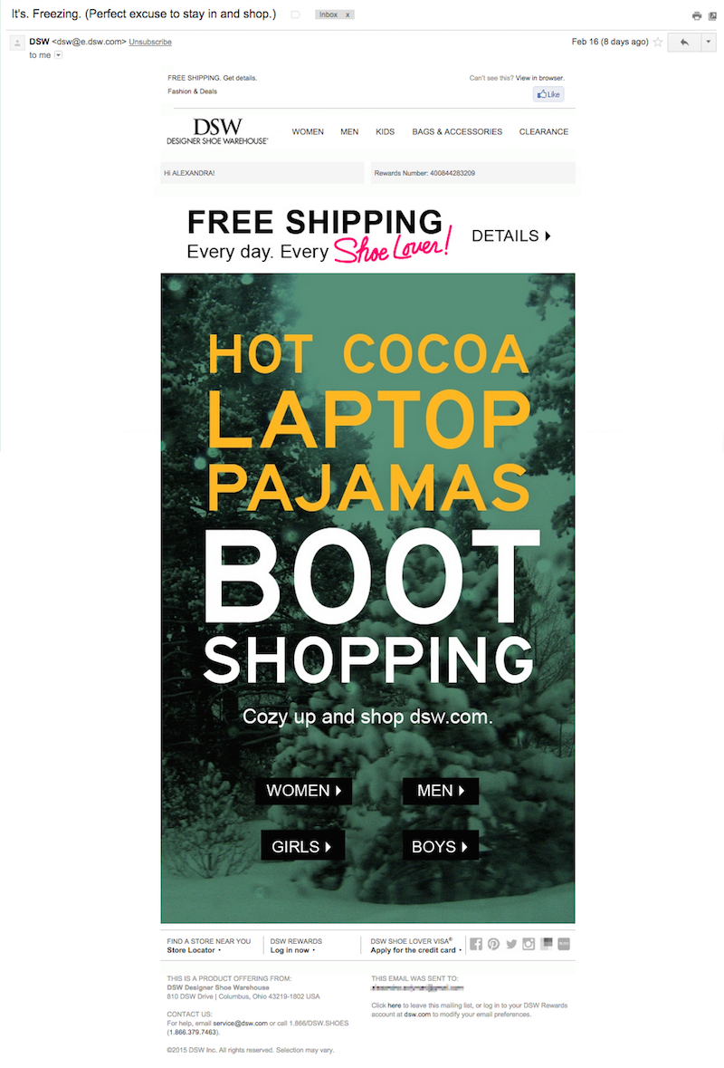
The subject line of the email below reads, “It’s. Freezing. (Perfect excuse to say in and shop.)” Indeed, the temperature plummeted on the week DSW sent this email.
Your recipients will be more likely to open and read emails that are well-timed and to which they can relate. Center your emails’ themes around events other than national and international holidays to maximize open and conversion rates.
26. Get social.
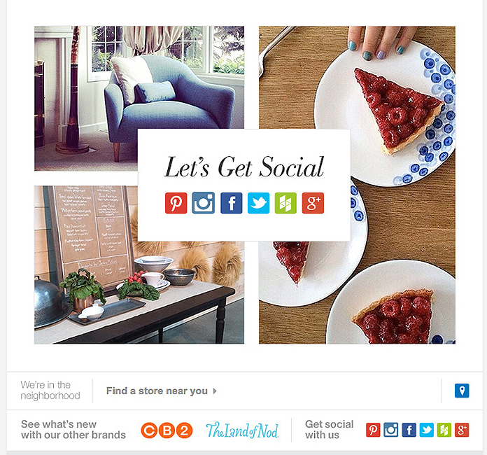
You can’t overlook the significance of social media today. It’s in your best interest to encourage your readers to spread your content. Crate & Barrel gives subscribers a whole bunch of options to share their newsletter.
Remember that every email, good or not, teaches you something. Now go make magic!