- All Posts
- /
- Email A/B Testing: Case Study from Emble.io

Email A/B Testing: Case Study from Emble.io
News and Updates-
 Adam Charles
-
Updated:Posted:
On this page
You know email is a powerful marketing tool. You also know that it has been abused by careless marketers and spammers for years. One of the best ways to ensure your emails resonate with your users is to constantly A/B test factors such as subject lines, tone and copy.
Making Email Better, One A/B Test at a Time
This is an analysis of an A/B experiment we did with the first email campaign for our startup emble.io — we help you to plan get-togethers, so you can have more fun with your friends, because that’s what life’s about, right? And even though we aren’t quite in beta yet, we wanted to start testing as soon as possible.
We were keen to gather some data from the lovely people who have signed up so far, in the form of an exciting and irresistible survey. Of course, email was the most appropriate way to ask whether our prospective emblers would answer a few questions for us.
With this in mind, we decided to test a rather big idea on this email campaign — one that could affect how we approach marketing for our new company. We wanted to know whether our customers were more interested to gain, or give to us. In other words, we used subject lines and calls to action (CTAs) to see what would drive the greatest response — in terms of opens, clicks, and conversions — to find out what motivates our initial user base.
Here’s what happened:
We sent out two emails with different subject lines and primary CTAs to 498 people:
A — Gain, aka ‘Jump’
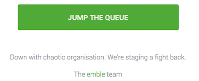
B — Give, aka ‘Help’

The carrot for each remained the same: If participants completed our super-short survey, they’d be given earlier access to the emble beta. However, both the subject line and the CTA were different; we designed the email so that the CTA would be very prominent, and likely the first thing readers would see when they opened the email.
NB: We wanted to take away the carrot entirely in our B email, however, we decided that would be counterproductive because we wanted survey completes.
The Race
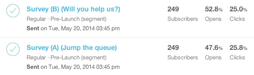
The email was sent. Our fingers were poised on the stat refresh button. At the beginning, “Jump” opened up a huge +7.3% CTR lead and pulled away on opens:
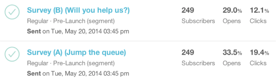
And continued to extend up to nearly +9% CTR:
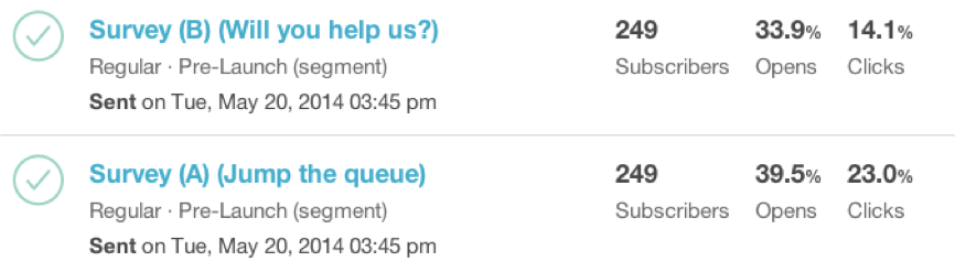
It looked like “Help” would be trounced … but then it asserted itself, closing the CTR gap and overtaking on opens:
While early results in any experiment should be taken with a large pinch of salt, the wide initial variance and subsequent catch-up was still interesting to note.
The Final Result
With the initial excitement dissipating, we hunkered down to other work and left our two horses to race to the finish, secure in the knowledge that both emails had fought bravely to demonstrate that , whether gain or give, people will act readily to both types of request (this gave us a warm fuzzy feeling).
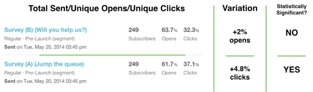
While “Jump” won in terms of creating a statistically significant larger CTR, it was great to see that “Help” elicited more opens, even though the difference wasn’t significant enough to provide insight.
“Jump,” therefore, inspired more action, but not by a huge amount. We thought it fantastic and inspiring to see that “Help” held its own in the end — what an awesome bunch we must have on our list so far!
Survey Completes
As a final measure, we wanted to see how the click activity fed through to the completion of the survey itself (as we consider that a conversion in this scenario), which was our main reason for the reach-out.
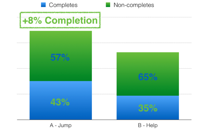
As you may recall, “Jump” had a +4.8% CTR over “Help”; however, it garnered a survey completion rate of +8%, which was disproportionately high compared with the CTR from the email. We know, that, on the surface, it seems like a “Well, duh” moment, but it does give nice insight into a specific group of people.
Some Other Stuff We Learned
- General Response Rate: We are hoping that we’ll continue to get this kind of response when the beta goes live. We are delighted by this first experiment and the engagement of the awesome people who signed up.
- We probably distracted up to 24% of people by using secondary links, even though these weren’t obvious. There was a good reason why we had to use them in this campaign, but we’ll be more conscious of potential distraction in the future.
- We got great data from the survey that will really help us in refining our marketing going forward and serving our members to the best of our ability.
Have you used A/B test to see what motivates your users? Let us know in the comments.
Check out this video to learn more about emble’s mission to simplify planning events.