- All Posts
- /
- How to Send Better Email Receipts

How to Send Better Email Receipts
Messaging and Automation-
 Jimmy Daly
-
Updated:Posted:
On this page
“A life cycle is a series of changes in form that an organism undergoes, returning to the starting state.”
The term lifecycle marketing infers that customers experience a contiguous, sequential process that does not end. Taken literally, this means that when a customer makes a purchase, they’ve reached the end of a cycle and are ready to begin again.
In practice, email receipts mark the end of that cycle. Too often, however, they fail to start it again. Besides serving as a proof of purchase, the receipt, like all other lifecycle emails, should move the user to the next step.
To illustrate this, we teamed up with Adii Pienaar, creator of Receiptful. His mission is to make receipts a serious sales tool. With Shopify and WooCommerce integrations in place (and more on the way), Receiptful makes it incredibly easy to send great receipts (and it’s free).
Adii and I looked at three different email receipts and each took a turn dissecting them. Have a thought on these emails or a better way to send receipts? Drop a note in the comments.
1. Etsy
Adii’s Take
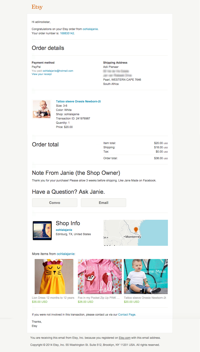
Etsy is a marketplace where artisans and craftspeople can sell their unique goods. In that sense, Etsy already has a challenge with their email receipts, as it needs to be generic enough for all of their sellers and should communicate Etsy and the seller’s brand identity.
On the receipt’s first impression, the minimalist and clean design style makes it clear that it’s an Etsy receipt. The top-half of the receipt however is just “average” … nothing really engages me or makes me want to scroll down further.
Towards the bottom of the receipt though, Etsy does two things really well:
- They provide you with more info about the seller. In this example, the seller uses a photo of themselves, which further humanizes this interaction and creates more of a personal connection. In tandem with the email subject line (“Your Etsy Purchase from oohlalajanie (168835142)”), it is clear that you’ve purchased an item from both Etsy and an individual seller.
- Even though the “More items from…” section could be emphasized more, the individual product visuals are fantastic and definitely draw me in.
Jimmy’s Take:
These email is a lesson in utility.
Every email receipt delivers information about the transaction itself but Etsy really takes it to another level with buttons to contact the seller, related products and even a map to show you where the seller is located. Context is king when it comes to email.
Receipts often fail because businesses treat them as the end of the customer’s lifecycle. Your marketing strategy worked! The customer moved through the funnel just like you wanted. Time to start all over!
Wait a minute.
You’ve already spent time and money acquiring this customer. This is your opportunity to up the ante by creating a great customer experience and making it incredibly easy for the customer to buy again.
This email does a great job offering the next step instead of saying goodbye.
2. Warby Parker

Adii’s Take:
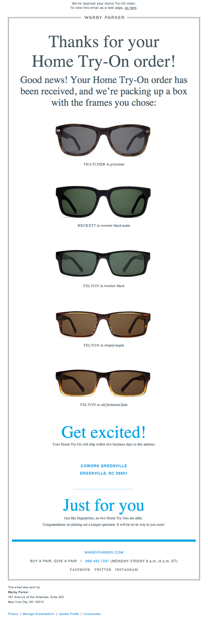
Warby Parker is an American brand of prescription eyeglasses and sunglasses. They design all of their glasses in-house and it’s evident that they apply that same design-focused attitude to their marketing efforts.
This example isn’t strictly a receipt … more of an order confirmation email. That said, online vendors can learn so much about how to captivate a reader in a seemingly mundane email.
How do you feel when you see this email?
I immediately feel excited about the glasses that are on their way and I relive the excitement I felt when I picked out these items. This is also emphasized with the “I’m Excited!” copy, which fuels the positive vibes.
The receipt includes very little copy and instead relies on great imagery to do the selling. The product front-and-center. In that sense, Warby Parker doesn’t rely on fancy marketing speak or tactics to achieve a marketing goal; it just allows its products to do its own talking.
Jimmy’s Take:
This email is just cool.
First, it looks great. As Adii mentioned, they invest a lot in design so why not showcase it in their emails? After all, it’s the reason the customer went to the site and placed an order in the first place.
The little bit of copy in the email sets the tone for an upcoming brand experience: the Home Try-On.
Just for you
Just like fingerprints, no two Home Try-Ons are alike. Congratulations on picking out a unique specimen. It will be on its way to you soon.
This helps build excitement for the arrival of the product. I also like that they included links to their social media sites. The links are passive – there are no strong calls to action – but for the right customers, it’s an opportunity to stay engaged with the brand in between buying cycles.
3. ASDA

Adii’s Take:
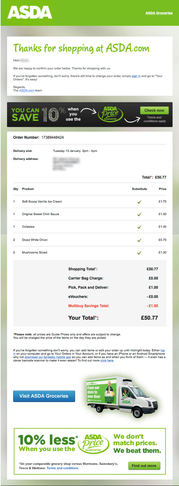
ASDA is a British supermarket chain that is owned by Walmart. In the last couple of years, ASDA has invested heavily in their e-commerce efforts and have reported double-digit growth in e-commerce sales for the past year.
The receipt above is exclusively from their online store and it has not yet been implemented as the digital alternative to their current paper in-store receipts.
That said, the receipt makes a very solid first impression and I especially like how their appreciation for my purchase is emphasized right at the start of the receipt. Whilst I intuitively know that I’m just another number in their books, it does make me feel better about purchasing from the store.
The best part of the receipt is the advertisement that they’ve included about their “Price Guaranteed” campaign (where they offer to match the the price of any item that you can get cheaper elsewhere). The advertisement in itself is generic and not tailored to the individual receiving the receipt, but it does two things really well:
- It forms part of a greater marketing strategy, which means the inclusion thereof in the receipts adds further awareness about the offer; and
- By including in at the top and bottom of the receipt, they’re essentially doubling the exposure and impact of the advertisement.
Jimmy’s Take:
ASDA could suddenly make receipts relevant again.
It’s always boggled my mind that grocery stores offer membership programs but don’t send email receipts (or other meaningful promotions).
Paper receipts are an afterthought these days … no one saves them because they aren’t very useful. An email receipt, on the other hand, can offer some immediate value before being archived.
ASDA does a nice job promoting their Price Guarantee program without annoying the customer. There’s even a subtle upsell: “If you’ve forgotten something, don’t worry, there’s still time to change your order.”
I hope they bring this to their retail locations soon. Email receipts will be a gamechanger for brick and mortar stores.
5 Ways to Upgrade Your Email Receipts
- Where possible, humanize the seller by showing photos of team members and / or sharing interesting, biographical data.
- Include recommendations for similar products.
- Be as visual as possible and put the products on center stage.
- Broadcast and share in the emotion of the buyer i.e. “Congratulations!” or “I’m Excited!”.
- Consider including the same marketing messaging in two positions on the receipt (top and bottom) to maximize the likelihood that the customer will take action.
Read more about growth hacking with email receipts and check out Receitpful for even more ideas.


