- All Posts
- /
- How to Measure the Success of Email Marketing Campaigns

How to Measure the Success of Email Marketing Campaigns
Messaging and Automation-
 Jimmy Daly
-
Updated:Posted:
On this page
It’s hard to measure the success of an email campaign, so we’re coming up with a better way. This post is an overview of the process we’re using as we measure and update our own campaigns. Some of the results are great and some aren’t. We’ve chosen one with mixed results to share here since there are more takeaways.
Would you like to see a reporting tool like this in Vero? Drop a note in the comments.
A Better Way to Visualize Email Data
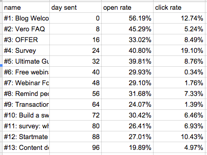
It’s easy to measure the success or failure of a single email, but what about an entire campaign? The table below is similar to what most email marketers see when they check their analytics. It’s useful but it’s essentially raw data. We’ve found a better way to visualize this data and we’re going to show you how to do it using our own blog welcome campaign (new blog subscribers receive this as an intro the blog and our service). Here’s a look at the campaign. Click the link on the right to see the actual email.
Note: Not all of the emails in this campaign contain full articles so there is no incentive for the recipient to click. Also, you’ll notice a mix of HTML, plain text, long form and short form. The goal is to collect data on different formats.
| Open Rate | Click Rate | |
|---|---|---|
| 1 | 56.19% | 12.74% |
| 2 | 45.29% | 5.24% |
| 3 | 33.02% | 8.49% |
| 4 | 40.80% | 19.10% |
| 5 | 39.81% | 8.76% |
| 6 | 29.93% | 0.34% |
| 7 | 29.10% | 1.76% |
| 8 | 31.68% | 7.33% |
| 9 | 24.07% | 1.39% |
| 10 | 31.42% | 6.46% |
| 11 | 26.41% | 6.93% |
| 12 | 27.01% | 10.43% |
| 13 | 19.89% | 4.97% |
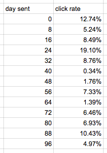
This is useful information but we wanted a better way to visualize it. So we copied it all over to a Google Spreadsheet and found a cool new way to examine it.
The first thing we did was separate the open rate and click rate so we could chart each individually.
Next, we highlighted the data and clicked the “Chart” button. We wanted to use a trend line in our chart, so we selected a scatter chart.
We did the same thing for open and click rates.
This is a cool way to view the data because it’s very easy to see which emails are killing it and which need to be cut (or seriously edited). The next step was combining the data into one chart.
Looks awesome, right? Now, let’s see what it tells us.
How to Read This Data
Engagement is highest through the first four emails, meaning that is when we should be using strong calls to action and maybe even offering extended free trials or deals on the service. Here are a few other takeaways:
- Open rates decline throughout the campaign but click rates stay relatively even. The group clicking through in the latter stages of the campaign that haven’t already started a free trial should be sent a special offer.
- The email with the highest click rate – a whopping 19.10% – is simply a link to our Ultimate Guide to Successful Email Marketing. These people want content and we need to do a better job providing “epic” resources like this one.
- The email with the lowest open rate is also content (link) but it’s not focused directly on email. People signed up for email resources and the data is proving that’s what they want.
- There are a few significant drops from one email to the next. Between emails #4 and #5, the click rate drops from 19.1% to 8.76%. We earned trust and threw it away in the next email. Emails that build trust are the perfect runway for a strong call to action. In this case, both emails offer great content but #5 simply isn’t good enough.
Anything else you would take away from this data? Give it a try on your own campaigns and let us know the results.