- All Posts
- /
- Graphing net churn using Redshift and SQL

Graphing net churn using Redshift and SQL
Data Management-
 Chris Hexton
-
Updated:Posted:
On this page
In 2015 two important trends emerged that everyone working to create great products and customer experiences will be interested in:
- It is easier than ever before to synchronise data from your SaaS tools into a data warehouse (often Amazon’s Redshift).
- There are more and more great tools (Periscope, RJ Metrics, Looker) that allow you to query and chart the data in your warehouse in a sophisticated way.
We’re big proponents for both of these trends at Vero. In this article, I’m going to introduce you to capturing and analysing data directly from a database using Amazon’s Redshift and Periscope Data. In this post we’re going to chart some basic SaaS metrics.
I’ve included a version of some actual SQL we use at Vero, and I’ve broken down how it works so you can use it, get inspired by it or build upon it.
You can apply the same approach I use here to chart virtually anything.
Note that this is a slightly new direction for our blog. If you want to learn more about SQL then let me know in the comments. I’m interested in breaking down how to chart other SaaS metrics, product usage, email interactions and so on. We’re passionate about this here at Vero.
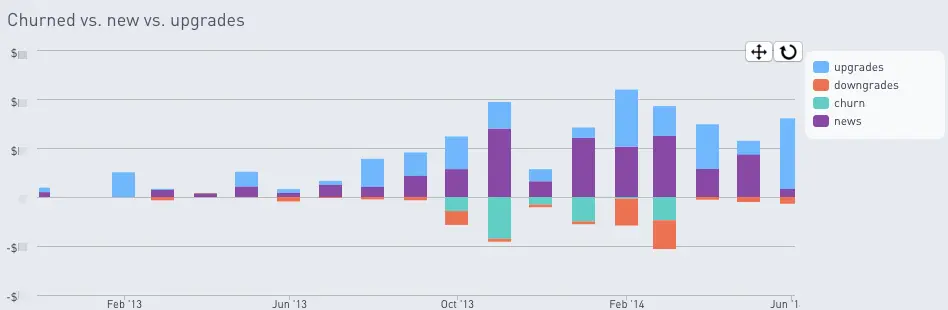
Charting upgrades, downgrades, new revenue and churn
Here’s an example of the chart we’ll be building, note that news means new revenue in this chart:
What you’ll need to do this yourself
Here’s the setup we use to get accurate and complete data and to chart it beautifully:
- Stripe handles 90% of Vero’s payments, so that’s the originator of the data in this graph.
- RJ Metrics’ Pipeline product syncs this payment data from Stripe to our data warehouse.
- Our data warehouse is hosted on a basic Amazon Web Services (AWS) Redshift cluster.
- We chart our reports using Periscope Data.
- We also use our own database with data about our users (in this case, the companies that use Vero). Our application uses a PostgreSQL database for this.
At our size, which is not insignificant, the primary cost here is Periscope. We use Periscope as it adds a caching layer and has some great features. We also graph a lot of other data in Periscope (not just the basic payment metrics) so this nets out well for us. The other products combined probably cost us around $300/month at this time (excluding Stripe fees, of course).
The SQL
To start off, I’ve included the full SQL script being used, so you can see the end goal. This SQL outputs a query table that has the month in the left column and then a column with a dollar figure for each upgrade, downgrades, gross churn and new revenue.
The resulting table can be charted using a tool like Periscope Data and a simple bar chart (as you saw in the example above).
Let’s step through the key parts of this SQL. I’m going to focus the patterns being used so that you can pick up a few tips on where to head with your own analyses.
Listing all payments
The first part of the query creates a temporary table called
all_payments that holds every payment, the customer
ID it belongs to and two columns showing whether the payment was
the first or last recorded for that specific customer ID. This
gives a nice clean set of data on which we can query throughout
the rest of the SQL.
In this table, it’s particularly important that we’re extracting the first time a customer paid and the last time a customer paid as these represent the month they onboarded and the month they churned). These two columns provide an easy means of querying this later on.
with all_payments as (
  select
    p.customer   as customer,
    p.date       as payment_date,
    p.total      as total,
    row_number() over(partition by p.customer
      order by p.date desc) as first_row,
    row_number() over(partition by p.customer
      order by p.date asc) as last_row
  from vero_stripe_production.stripe_invoices p
  where p.period_end - p.period_start <= 2678400
)
Listing new customers, per month
The following snippet of SQL creates a temporary table which holds the dollar value for new revenue in any given month. It has two columns: the month and the total new revenue for that month, in dollars.
news AS (
  select sum(all_payments.total)/100 as total,
    date_trunc('month',
      (timestamp 'epoch' + all_payments.payment_date * interval '1 Second ')
    ) as month
  from all_payments
  where all_payments.last_row = 1
  group by date_trunc('month',
    (timestamp 'epoch' + all_payments.payment_date * interval '1 Second ')
  )
)
The SQL above queries the all_payments temporary
table we created earlier and sums the
all_payments.total column, grouped per month, to
get the data we need.
There is one section of the query that is a bit fancy and worth
reflecting on. Stripe stores the column
all_payments.payment_date as a Unix integer
timestamp. In order to output the nice, consistent date format
2016-02-01 we need to convert them. As we’re using
Redshift to do our queries, the following SQL example handles
this:
date_trunc('month',
      (timestamp 'epoch' + all_payments.payment_date * interval '1 Second ')
    )
Querying upgrades and downgrades between months
The following SQL makes up the most complex in the entire query in the sense that there is a lot going on:
plan_changes as (
  select
    vero_stripe_production.stripe_invoices.customer as customer,
    date_trunc('month',
      (timestamp 'epoch' + vero_stripe_production.stripe_invoices.date * interval '1 Second ')
    ) as month,
    case vero_stripe_production.stripe_subscriptions.plan__interval
      when 'year'
      then vero_stripe_production.stripe_invoices.total/100/12
      else vero_stripe_production.stripe_invoices.total/100
      end as now,
    coalesce(
      case all_payments_by_month.plan__interval
        when 'year'
        then all_payments_by_month.total/100/12
        else all_payments_by_month.total/100
        end,
      0) as before,
    (case vero_stripe_production.stripe_subscriptions.plan__interval
      when 'year'
      then vero_stripe_production.stripe_invoices.total/100/12
      else vero_stripe_production.stripe_invoices.total/100
      end) - (coalesce(
        case all_payments_by_month.plan__interval
        when 'year'
        then all_payments_by_month.total/100/12
        else all_payments_by_month.total/100
        end,
      0)) as change
  from vero_stripe_production.stripe_invoices
  left outer join all_payments_by_month
    on date_trunc('month', add_months((timestamp 'epoch' + vero_stripe_production.stripe_invoices.date * interval '1 Second '),-1)) = all_payments_by_month.date_of_invoice
    and all_payments_by_month.customer = vero_stripe_production.stripe_invoices.customer
  join vero_stripe_production.stripe_subscriptions
    on vero_stripe_production.stripe_subscriptions.id = vero_stripe_production.stripe_invoices.subscription
  where vero_stripe_production.stripe_invoices.forgiven is not true
    and vero_stripe_production.stripe_invoices.paid is true
    and coalesce(all_payments_by_month.total/100,0) <> 0
    and vero_stripe_production.stripe_invoices.period_end - vero_stripe_production.stripe_invoices.period_start <= 2678400
)
Ultimately, this SQL query outputs a table with five columns:
customer (the customer ID from Stripe),
month (in the format 2016-02-01),
now (the amount the customer paid in the given
month), before (the amount they paid the month
before), change (the difference between
now and before).
There are a few complex sections of this snippet, so I’ll talk through these one-by-one.
Firstly, we use the SQL case statement. This allows
us to return a one of two different results in the
now, before and
change columns based on the value of the
stripe_subscriptions.plan_interval column.
In this example, we’re checking whether the Stripe subscription
interval is set to year or to
month. If it’s set to year, we divide the total
payment made by 12. This is to ensure we smooth out the numbers
– otherwise we’d see huge spikes in MRR in months where
customers paid annually:
case vero_stripe_production.stripe_subscriptions.plan__interval
      when 'year'
      then vero_stripe_production.stripe_invoices.total/100/12
      else vero_stripe_production.stripe_invoices.total/100
      end as now
We use this same methodology for the before and
change columns.
In the plan_changes query we also do two joins. One
of the joins is used to link the Stripe
vero_stripe_production.stripe_invoices table we’re
using with the Stripe
vero_stripe_production.stripe_subscriptions. To
create this join we tell the query which column links the two
tables. In this case it’s the
stripe_subscriptions.id column, as this
id is present in both tables, represented as
stripe_subscriptions.id and
stripe_invoices.subscription:
join vero_stripe_production.stripe_subscriptions
    on vero_stripe_production.stripe_subscriptions.id = vero_stripe_production.stripe_invoices.subscription
One final, handy little trick, in the
plan_changes query is the use of
coalesce. This tells the SQL to return either the
first value or, if that’s blank, return the second value. I have
used this in a few places where we want to return
0 rather than null to ensure there is
a value present that can be used in calculations. Here’s an
example:
coalesce(all_payments_by_month.total/100, 0)Pulling it all together
The last part of the SQL creates the final table that will
actually be charted. It has columns for month,
new (new revenue), churn,
downgrades and upgrades.
Before running this SQL we consolidate each key metrics into its
own temporary table, one for news, one for
downgrades and so on. We’ve already covered the
temporary table news up above. That example outputs
a table with each month and the dollar value of new revenue for
that month. The same thing applies for the other three temporary
tables we create in the overall SQL: churns,
downgrades and upgrades.
We can then join and query all four tables and create one, clean table for Periscope Data to chart.
select
  upgrades.month,
  upgrades.total                as upgrades,
  coalesce(downgrades.total,0)  as downgrades,
  coalesce(churns.total,0)*-1   as churn,
  coalesce(news.total,0)        as news
from upgrades
left outer join downgrades
  on upgrades.month = downgrades.month
left outer join churns
  on upgrades.month = churns.month
left outer join news
  on upgrades.month = news.month
where upgrades.month < (select date_trunc('month', current_date))
You’ll note two things that are important about this query:
- We use a `left outer join` to ensure that if any of the tables we’re querying are missing a value for a certain month that they do not cause the table to break.
- We exclude the current month as this will always render incomplete and show wildly exaggerated churn and downgrade figures until the month passes (as not everyone has been charged for the current month as it proceeds).
Both of these help ensure the resulting graph doesn’t have any gaps or jagged data, keeping our graph accurate and smooth.
Why use SQL at all?
This example is just the tip of the iceberg! The beauty of using SQL for this sort of charting is that not only can you fully customise the resulting charts, but you can query data across databases, allowing you to do really sophisticated analyses. For example, we could run this same report but limit it to companies that have interacted with Vero in the last seven days, or to companies that have more than 50 campaigns, or to companies that have been with Vero for a certain amount of time.
If you’re interested, please leave a comment or email me at chrish@getvero.com. There is so much that can be done with SQL and I’m excited to share how we use the same data to run queries across multiple databases and also chart our email interactions.
We’ve found running SQL queries allows us to produce consolidated reports which actually get looked at and actioned. It’s forced us to be selective about what we query and this may be one of the most valuable aspects of the whole thing!
Note: this script is slightly different from the one we use in production and has been pared down for this article, so if you see improvements or breaking code (though, it has been tested with our setup), please let me know and we’ll update it.