- All Posts
- /
- How Unhaggle Increased Click Through Rates 378%
How Unhaggle Increased Click Through Rates 378%
News and Updates-
 Chris Hexton
-
Updated:Posted:
On this page
We’d like to introduce you to some friends of ours—Unhaggle.
Unhaggle helps car buyers get the best price on a new car without the hassle of negotiating.
They do this by getting up to 10 dealers to compete through a reverse auction process that’s guaranteed to get the lowest price. They also show car buyers the average price people have paid for any car in their neighbourhood and the car dealers’ cost for free.
The result is what Unhaggle describes as “the smartest way to buy a car” and they’re not wrong.
Recently, Unhaggle implemented some remarketing emails as a way to bring customers back to their site and to get them to download a free dealer cost report.
The reason for this campaign is that customers who download the report are much more likely to become a paying customer. Thus, it’s an important step for visitors to take.
To begin, the team at Unhaggle followed the advice in one of our articles titled “How Flightfox doubled their remarketing email conversions.” This post advocates a Q&A style approach to writing remarketing emails, the aim being to address customers’ fears head on by providing the answers to the three most common questions you receive from your customers.
Using a Q&A style letter for the first email, Unhaggle found that it worked reasonably well, but they weren’t completely happy with the results. They decided to test some different approaches to see if something else would convert at a higher rate. Specifically, they decided to test the following:
- Using a series of images instead of just text.
- Driving customers toward a page that let them choose their specific make of car so they would download a more relevant report.
- Including links directly to specific, popular vehicles as a way to entice visitors to click and learn more.
Below are samples of what the e-mails looked like before and after the changes were made.
Before: 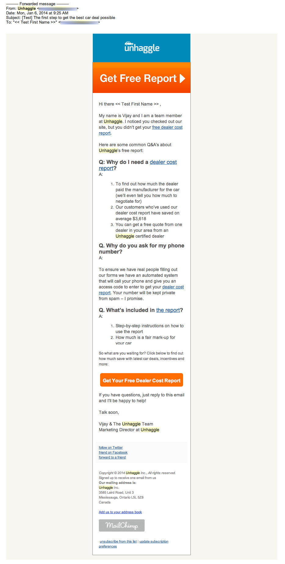
After: 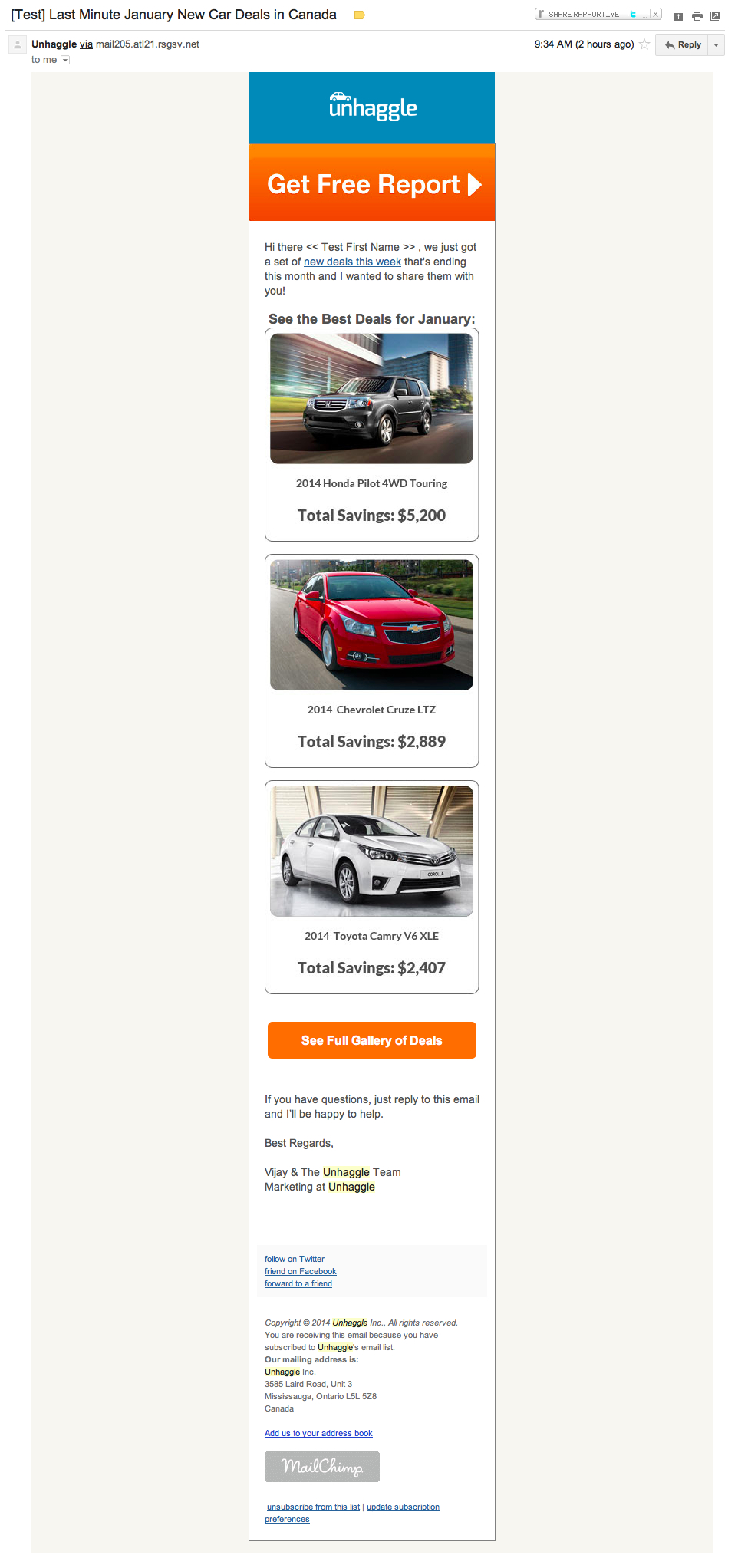
As you can see, the second email takes an entirely different approach and is much more visual than the initial, text-heavy, Q&A style email.
So – what were the results of this experiment?
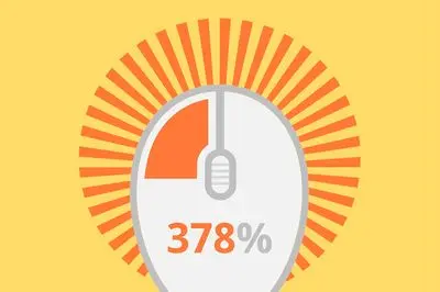
Click through rates went up by 378%!
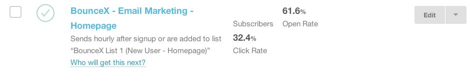
Here’s a snapshot direct from Unhaggle’s email provider. The
changes they made in the second campaign helped Unhaggle achieve
a massive 32.4% click through rate. This is one
of the highest click-rates we’ve seen recently:
What exactly made the difference?
With tests like this, it’s interesting to consider what made a difference and convinced more people to take action. Based on what we can see here, the key factors are:
- Images and visuals stirred up emotions: each visitor’s desire for a new car is part of a buying process that’s largely emotionally driven.
- The Q&A was too wordy: it wasn’t punchy enough to hit visitors hard. After all, they had only briefly visited Unhaggle in the past.
- It mentioned price more clearly: by emphasizing the deals people would receive, there was better alignment with the goal of “saving money” versus getting a “dealer report”. People don’t want the report: they want to save money.
What’s interesting about these results is that in past articles, we often talk about NOT using images, but this is a case where that advice is clearly wrong.
It’s really important to remember that best practices are just that, as referred to in this article about best email optimisation practices debunked: every change you make needs to be tested to ensure it’s the right thing to do for your audience and will improve your email conversions.
It’s also important to consider that certain types of email communications make more sense for visual presentations. Amazon and Net-a-Porter are both compaines we’ve featured a regularly that successfully use lots of images in their email campaigns. This is due to the fact that sometimes text isn’t as captivating, especially when you’re selling products to an emotional buyer.
Here’s what Vijay Jeyapalan, Marketing Director at Unhaggle, had to say about the 378% increase in click rate.
There are two big take-aways I learned from optimizing this email marketing campaign.
- Create multiple links to your destination page throughout the email and not just in one or two CTAs. As different parts of the email may trigger someone’s interest and you want it to be linked so you can drive them to convert.
- Even though you may see email copy work for other’s in your industry or even in general, it might not be the best for your email marketing campaign. It’s always best to use them as case studies to draw key learnings or test it with a variety of email designs to see what truly engages your customers.
So, what about you?
What did you take away from this case study? Leave a comment to let us know what you learned and what you plan to test in your future campaigns!